Tribe Meditation
Providing a safe space for those who are dealing with anxiety at various levels, using an online community that focuses on the person's overall mental wellness.
Due to the recent pandemic in 2020 many people faced mental health adversity which helped launch remote applications or tools for people to seek out help. Other apps state users can achieve mental wellness through meditation and reflection. However, most other apps do not offer the user a sense of being heard through the app itself or connecting them with someone to feel heard. Tribe Meditation app wants to create efficient ways to cope with anxiety in a format where the user feels they are supported and to provide effective ways to deal with anxiety or high stress situations.
An end-to-end process consisting of research, competitive analysis, user interviews, user flows, information architecture of the MVP, UX low-fi design wireframes, gorilla testing, creating red routes, style-guide for app, & final UI wireframes for app.
The solution was a multifaceted application that included meditation, journaling, monitoring emotions, community chat and sourcing for professional counseling as well as a custom feature. That feature would be an AI designed to respond back to the user based off the users disclosed feelings.
Research.
User interviews were conducted with those who have a history of anxiety and/ or stress. Along with readings from multiple research papers on the topic, the following was considered when creating the next phase in personas
Research discussed healthy holistic habits to reduce anxiety and stress with 5 to 12 minute meditations, eating healthy, exercise, a good night’s rest, deep breathing and talking to a therapist.
The most commonly occuring healthy coping skills to deal with anxiety based off user interviews were journaling, meditation, exercise, talking to friends or themselves, breath work and planning in advance.
Personas.
Two personas were created, Vanessa and Liam. Vanessa is a recent grad and starting to set up her new life after college. She lives in a constant state of anxiety. Liam is more settled in his life, but gets triggered by work and social events.
Both situations are consistent with those who participated in the user interviews, which reveals that anxiety and stress will appear at any stage of life.
The idea was to create a discreet and easily accessible app that could benefit users in stress induced environments like work or social gatherings. The app could be easily linked to any wearable device that monitors heart rate and stress levels. The integration with both will help gauge the users anxiety and/or stress levels.
Insight & Ideate.
The insight revealed through user interviews showed that most users were having anxiety when dealing with work and social events. Since environmental change wasn't possible in every situation, a more discreet approach was needed.
MVP.
MVP’s started out by being an easy login, calendar, journal, mantra and a reminder to breathe. As most of those features were kept, other features such as a live chat and personal improvement graphs were added so users would be able to talk about their feelings and monitor their growth.
These features were to be included for MVP because it was the most direct way to help anxiety based on the research that was read. Also based on user interviews this is how users were lowering their anxiety.
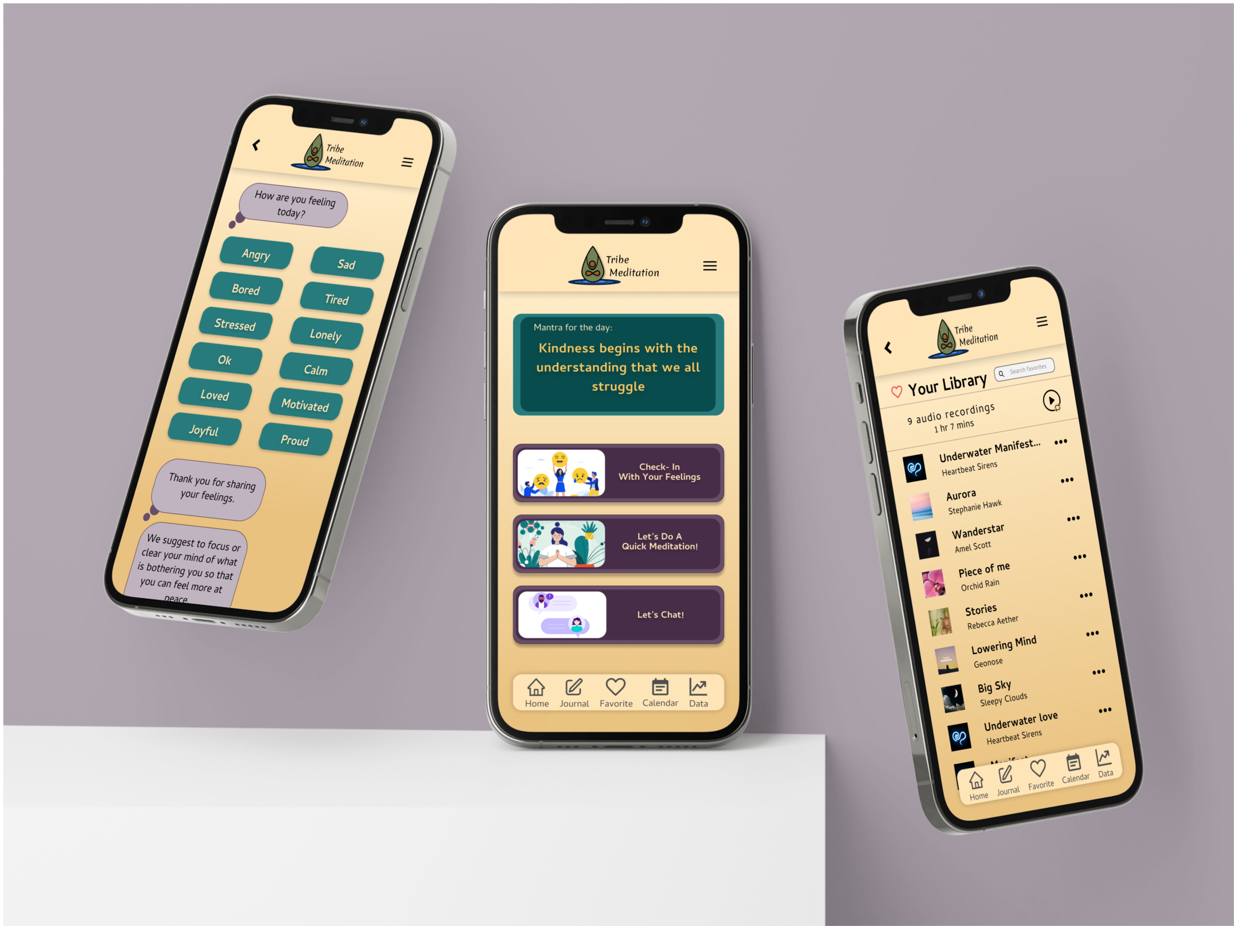
This site map followed directly with what was chosen for minimal viable product, which was profile/ settings, calendar, feeling check-in, journal, data and live chat. After user interviews, users expressed that including an audio favorite list and an option to immediately do a quick mediation would be a great addition to the app, in which those were added to the site map later.
Site Map.
User Flow.
This user flow is the process in which the user takes when they use the app to check in on their feelings. First, they would be prompted to choose what emotion they relate to. The app will respond based upon the user's answer depending on if it was a positive or negative emotion.
If it were a positive emotion then they would be prompted with what activity they would like to participate in, the user would choose the activity and go through the process.
With the negative response, users would be asked what topic was bothering them (work, PTSD, phobias, social, etc.) then the user would be asked what activity they would like to participate in.
This allows the user with a negative response to feel heard and to help them identify what was a trigger for their stress/ anxiety.
Sketching.
When first sketching the thought was to make sure that all carefully curated MVP’s were to be displayed on the home page.
After conducting user interviews, the initial homepage had to be redesigned due to the overwhelming feeling that this brought on to the users.
Wire Frame.
This wireframe was used as the first prototype for user interviews in Guerrilla testing.
With this prototype and guerrilla testing, the findings indicated that users wanted an option to link them directly to meditate.
Also users questioned where the “liked” audio was to be found in the prototype which then created another feature to include.
Lastly, users wanted easier access to the home screen so they could go back to the previous screen, this gave the idea there needs to be some sort of navigation bar included.
Guerrilla Testing.
Guerrilla testing was done at a common workspace called “We Work” and at a local cafe in San Diego. Participants were awarded with food for their 15 minutes of participation.
LoFi Wireframe.
With the first digital low fidelity wireframe, this design included a navigation bar that held 3 features while the rest were on the home screen giving some sort of indication of what the screen would look like on a phone.
The audio favorite tool (heart icon), was placed on the navigation bar for easy access, if users liked an audio they would have access to their favorites.
Other screens like the favorite library for audio and an audio information screen were added in this redesign. These were to help the user know more information of what/who they are listening to and features such as share, unlike song, etc. were added.
Mood board
Inspiration was drawn from the simple and straightforward designing, which was incorporated into the login, homescreen and calendar design. Having a hover navigation bar was ideal so the user would be able to see what laid behind it indicating more content for the user.
Another inspiration was seeing soundwaves when listening to audio, having a deep contrast with colors in the background when listening to that audio, and the chat bubbles making them feel friendly no matter the context.
Nature was the true inspiration for the color palette. People are rooted in nature because of the peace and tranquility that nature provides. We wanted to convey this with ease in the app and we did so through peaceful images and pulling colors from nature.
HiFi Wireframe.
For this high fidelity wireframe many frames were updated to fit industry standards. The user testing and feedback was the main reason for these updates. When choosing the colors, nature was the main inspiration; however, there needed to be dark, bright and neutral organic colors hence this color palette was chosen.
A hamburger menu was added into the design for “profile” and “setting” features, user testing showed that transitioning from a person icon to hamburger menu was a successful design decision.
Most users during user testing could not find the calendar on the home screen so this indicated that there needed to be a better way to establish the calendar. It was given a place on the navigation bar with a calendar icon and labeled.
As for the other tools such as journal and data they were originally on the homescreen; however, they were not appealing to the eye and seemed overwhelming. The location of these tools were relocated in the redesign to the hovering navigation bar and labeled.


In Conclusion
The user could now use this platform of wellness to relieve anxiety and stress by using the suggested healthy outlets given by “Tribe Meditation”. The app makes the user feel heard and provides a community to connect to and share experiences and feelings with others. This is a feature other competing apps don't provide.
Next Iterations:
Incorporating a live group meditation for the community so they can meditate at the same time all over the world. This feature would include a countdown timer and the ability to see how many participants joined the live meditation.
Enlarging & redesigning graphs so that the users would have a more detailed look at their personal data and be able to set goals for themselves.
When checking in with one’s feelings in the app, there should be a new statement for every feeling and also a new mantra that coincides with the topic they want to focus on.
Create an algorithm of mantras for the home screen so they will never be the same when the user logs in or incorporating a version of AI that can assist people with understanding their emotions.
This project came with some difficulties; however, I learned alot from them. The most challenging part was creating the logo. When I tried to get a logo off the free market, no logos were speaking to me nor did they get the framework of what I was trying to portray. I decided to make the logo myself by incorporating a drop of water with a ripple effect and a person inside the droplet doing an easy sitting arm raise pose. It so happens that the person’s knee is an infinity sign heavily seen in meditation and yoga.When users saw the logo they did not know what it was, so after a week of spending hours on versions of the logo I came up with what you see here. I made it more condensed, I wanted there to be a person of color in the middle since “Tribe” is a word used in the community and felt that needed to be portrayed.
Due to the parameters that were given by Springboard in order to pass this project it was necessary to use certain design tools. I believe that in the real world many of these design tools that were mandatory for me to use was overlapping in knowledge and not necessary. I would have liked to choose what design tools to use however I understood the project requirements and learned on how to better use these tools for the future.
This project taught me so much, with time management being the most important. Having a calendar to draft how long each project will take, along with giving myself a time cushion would be helpful things to implement in future projects.
Another valuable lesson learned was to do a run though with a familiar person to workout any kinks before introduced in initial user testing
Lastly, I learned about the end to end process in which a prototype starts from a thought, to research, to an idea, to being a prototype and close to handing off to an engineer. This project was a journey and only the beginning of many lessons to be learned and applied to future projects.